
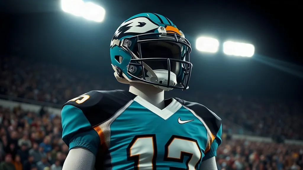
Week 6 of the college football season delivered its usual mix of upsets, blowouts and highlight-reel plays, but the most talked-about moment may not have happened between the whistles at all. Coastal Carolina unveiled a throwback uniform that leaned all the way into maximalism, and in doing so it separated itself from a weekend full of safe, committee-approved alternates. The Chanticleers are throwing it back to the 1990s, which is a curious choice for a program that did not even exist yet during that decade. That contradiction is exactly what makes the look so fascinating.
Uniform reveals have become their own genre of content, complete with teaser videos, midnight drops and social media countdowns. Most of them blur together. Coastal Carolina's did not. The design embraced a specific era with conviction, using bold color blocking, retro lettering and a silhouette that felt pulled from a dusty VHS tape of a regional broadcast. In a sport where every team now has a blackout, a whiteout and at least one chrome helmet, standing out requires more than a fresh paint job. It requires a point of view.
Why a 1990s Look Works for a Program Born in the 2000s
There is an obvious irony here. Coastal Carolina's football program did not exist in the 1990s, so a throwback to that era is not a literal callback to its own history. It is something more interesting: a fictional heritage, an imagined past. The Chanticleers are borrowing the visual language of a decade they never played in and using it to build a mythology. That is a bold move, and it is also a smart one.
College football is obsessed with tradition, but tradition is not evenly distributed. Blue bloods can trot out leather helmets and genuine archival footage. Younger programs have to manufacture their own sense of history or risk feeling rootless. Coastal Carolina chose to invent rather than imitate. The result is a uniform that feels both nostalgic and entirely new, which is a difficult trick to pull off.
The Power of Specificity
What separates a great alternate from a forgettable one is specificity. A generic retro uniform with a script font and a stripe can feel like a costume. A uniform that commits to a particular aesthetic, with distinctive typography, unusual color placement and a clear reference point, feels like a statement. Coastal Carolina's Week 6 look did the latter. Every element seemed to be in conversation with the era it was referencing, from the wordmark to the trim.
That level of detail matters because fans can tell the difference. Social media reaction was immediate and largely enthusiastic, with the look spreading well beyond the Chanticleers' fan base. When a uniform travels that far, it is not just apparel. It is marketing, recruiting and brand identity all at once.
The College Football Uniform Arms Race Is Getting More Creative
For years, the alternate uniform market was dominated by a handful of templates. Teams swapped in a matte helmet, added a gradient, and called it a day. That approach still exists, but the bar has risen. Programs now work with designers who understand fashion, streetwear and graphic design, not just athletics. The results are more ambitious, and occasionally more polarizing.
- Heritage brands lean on genuine archival references.
- Newer programs invent their own visual mythology.
- Designers borrow from music, film and fashion eras.
- Social media rewards boldness over restraint.
Coastal Carolina's throwback fits squarely into that evolution. It is not trying to be timeless. It is trying to be memorable. In a 12-game season where dozens of alternates will be unveiled, memorable is the only metric that matters.
Recruiting Is the Real Scoreboard
It is easy to dismiss uniform chatter as style over substance, but recruiting tells a different story. High school athletes grow up consuming images, and a program that looks current, bold and confident sends a signal. Coaches know this. That is why so much effort goes into reveals, photo shoots and player-led social content. A uniform that trends nationally is a free advertisement that reaches exactly the audience a program wants to impress.
For a Group of Five program like Coastal Carolina, that kind of visibility is especially valuable. The Chanticleers cannot outspend Power Four rivals, but they can out-design them. A single viral uniform can do more for brand recognition than a mid-tier bowl appearance, at least in the short term.
What Makes a Throwback Uniform Actually Work
Not every retro look lands. Some feel like a clearance rack. Others feel like a history lesson nobody asked for. The ones that succeed tend to share a few traits, and Coastal Carolina's Week 6 design checked most of the boxes.
- A clear era reference that fans can identify immediately.
- Typography that feels authentic to the period.
- Color choices that pop on television and in photos.
- Enough restraint to avoid becoming a novelty.
The balance between bold and busy is delicate. Maximalism can tip into chaos if too many competing elements are stacked together. Coastal Carolina walked that line by anchoring the look in a coherent palette and letting one or two signature details carry the concept. That is textbook design thinking applied to sportswear.
The Broadcast Test
Uniforms are not just seen in still photos. They are seen in motion, often from a distance, on a screen that compresses detail. A design that looks striking in a locker room shot can turn to mush during a broadcast. The best alternates are built for both. Coastal Carolina's look held up on television, which is ultimately where most fans encountered it.
Why Week 6 Became a Uniform Showcase
Week 6 has quietly become a prime slot for alternate uniforms. Conference play is in full swing, national attention is high, and programs are looking for any edge in visibility. It is also early enough that a bold look can define a team's identity for the rest of the season. Coastal Carolina took advantage of that window.
The timing also matters because the college football calendar is crowded. Rivalry weeks and bowl season dominate the back half of the schedule. A mid-October reveal can get lost. Week 6 offered a cleaner stage, and the Chanticleers made the most of it.
Frequently Asked Questions
What era did Coastal Carolina's Week 6 throwback uniforms reference?
The uniforms drew on 1990s aesthetics, even though the football program did not exist during that decade. The design used bold color blocking and retro typography to evoke the period.
Why would a program throw back to an era it never played in?
Younger programs often invent a visual heritage rather than reference real history. It allows them to build a distinctive identity and stand out in a crowded uniform market.
Do alternate uniforms actually help with recruiting?
They can. Recruits consume a lot of visual content, and a bold, well-executed look can raise a program's profile. It is one of the few marketing tools available to every school regardless of budget.
What makes a throwback uniform successful?
A clear era reference, authentic typography, strong color choices and enough restraint to avoid looking like a costume. The design also has to read well on television, not just in photos.
Will Coastal Carolina wear the throwback look again this season?
Programs often reserve alternate uniforms for specific games, so a repeat appearance would depend on the team's plans. The strong reception to the Week 6 look makes another outing plausible.